For this exercise my task is to annotate an image of a classical figure sculpture. This time I must consider issues such as anatomical accuracy versus the portrayal of an ideal, realism, gesture, gender symbolism and eroticism.
Also, I must select a classical figure which I know has been reused or adapted at a later time and compare these later uses with the original.
My chosen sculpture is Pluto and Proserpina, 1620-21 by the Italian Baroque artist Gianlorenzo Bernini. I have selected this sculpture in particular as Bernini is one of my all-time favourite sculptors and I have been fortunate to have seen this work in situ at the Galleria Borghese in Rome. I am a fervent admirer of his work due to the exuberance and sensuality of his sculptures which in my view are incredibly life-like and stunning to behold.
-

-
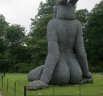
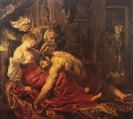
Pluto and Proserpina, 1620-21 by Gianlorenzo Bernini.
-

-
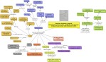
Spider diagram analysis of Pluto and Proserpina, 1620-21 by Gianlorenzo Bernini.
-

-
Spider diagram analysis of Pluto and Proserpina, 1620-21 by Gianlorenzo Bernini.
-

-
Spider diagram analysis of Pluto and Proserpina, 1620-21 by Gianlorenzo Bernini.
-

-
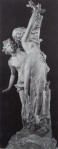
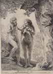
Rape of a Sabine, 1583, by Giovanni Bologna.
-

-
Sketch of Pluto and Proserpina, pencil, 2016, Lucy Dean.
Interpretation
In this artwork it is clear to me that Bernini is celebrating a story from antiquity. The legend states that Pluto, God of the underworld rises up to the Earth one day and meets Proserpina and falls head over heels in love with her. She encounters him whilst picking flowers in a meadow with her friends. He shortly becomes so smitten with her that he abducts her and forces her to live with him in the underworld. Bernini depicts the moment when Pluto gathers her up in him arms and flees with her. She seems to swipe ineffectually at him with tears in her eyes.
Pluto is envisaged in the traditional manner of antiquity in that he has a long bushy beard and a crown to denote him as God of Hell. His companion, the three-headed dog Cerberus is pictured barking below them. His role is as protector of the gates to Hell.
Context
Bernini was profoundly influenced by his father Pietro, who like him was much acclaimed for his skill in regards to the modelling and cutting of marble. His father was responsible for his early training and introduced him to important patrons such as the Borghese and the Barberini families, who commissioned him throughout his life.
Pluto and Proserpina, was created in 1620-21 for Cardinal Scipione Borghese and was one of a series of works which helped launch his stellar career in Rome as an official artist for the Papal Court. I believe the artwork was created in order to assert and cement the Cardinal’s reputation as a connoisseur of fine art. The work itself represented a complete departure from other artworks of the period due to the artist’s exemplary skill in modelling marble. Furthermore, the sculptures he produced for the Cardinal revolutionised the art of the era as they each possessed an emotional depth of feeling which was absent from the Mannerist works produced by Bernini’s contemporaries.
I think the artwork is influenced by the rise of the Papal Court as the Popes required a style of art which would embody their ideals and inspire devotion. Furthermore, Bernini’s oeuvre seems to epitomise an era when people desired art which was more authentic and realistic.
I believe that Pluto and Proserpina was one of a series of sculptures which was always intended to be displayed as a piece of art in the home of Cardinal Scipione Borghese. It was a place where he could retreat to and could entertain his powerful guests and show off his wonderful collection of art. Therefore he required large free-standing sculptures which would inspire awe and excitement. The subject matter of the sculptures refers more to themes of antiquity rather than the Christian faith but that doesn’t mean that they couldn’t be enjoyed by the Papal community. In fact I’m sure that having some original Bernini’s in his home would have established the Cardinal’s reputation amongst his peers as a serious collector of art.
Bernini and Bologna – the similarities and differences
Bologna’s Rape of a Sabine, 1583, is a marble sculpture which bears some resemblance to Bernini’s Pluto and Proserpina in terms of expressing an abduction as a theme from antiquity. Both artists present a nude female being taken captive by a nude male and both describe the ensuing struggle, but in very different ways.
In Bologna’s version the Sabine woman is held aloft by a muscular male figure and leans affectedly to one side with an outstretched arm. Beneath them a man shields his face from view and hunkers down low. The Sabine woman is supposed to have been kidnapped and taken captive by a Roman in a blaze of fury but in Bologna’s version the Sabine man seems to wish to avoid any involvement and does little to detain her captor. The whole scene is traditionally one of great ferocity and activity, however in Bologna’s version it all falls flat. This is due in part to the Mannerist tendency to depict scenes in an indifferent and unemotional way.
When one regards the two sculptures it is clear that they differ hugely in terms of their emotional impact. Bologna describes the events with a detached and uninterested gaze whereas Bernini’s figures seem to explode apart by the force of their mutual desire. Also in Bologna’s version the Sabine woman seems to give up to the inevitable whereas in Bernini’s version the female figure has more spirit and determination.
I dislike Bologna’s version as the gesture of the poses come across as affected and unconvincing due to the complete lack of facial expression and the idealised faces and forms. Also, his rendition lacks the vitality and youthful exuberance of Bernini’s. In short, I far prefer the modelling and attention to detail of Bernini’s creation, the effects of which are utterly sublime.
I feel in Bologna’s interpretation the sculpture should excite me as he’s showing us one of the most arresting parts of the story, but instead it comes across as static and forced. Also, the man who is cowering beneath the Sabine and her captor provides little visual appeal.
There are similarities in terms of the thee-figured composition which was viewed by Bologna as a great achievement as he was the first artist to accomplish what Michelangelo could not – a sculpture which celebrated a trio of figures interacting with one another in a single piece of marble.
It is important to state that Bologna was a Mannerist artist and as such was more interested in depicting the forms rather than the emotions. Bernini was an artist of the Baroque- a period of great artistic and spiritual inspiration, thus his style met the needs of the Vatican who desired a more dramatic and evocative art to reflect their status and divine inspiration.
In Bernini’s sculpture he replaces the third figure with the mythological three-headed dog Cerberus to complete the narrative and to explain the role of the figures in the story. He depicts Cerberus rearing his head in expectation and acceptance of his new mistress.
What sort of processes and techniques do I think the artist used to create the artwork?
Massing in
It seems to me that the artist used a technique known as ‘massing in’ in order to create this fine piece as it would have been necessary to chisel away the largest shapes first in order to create the overall structure and form. I have been instructed in the Renaissance method and I know that as an artist, our aim from the very beginning is to consider the whole structure before we approach the more detailed areas. Therefore one must consider all of the main proportional relationships first so as to arrive at an effective and accurate anatomical structure.
Proportion and gesture
The main point to remember in a sculpture as dynamic as this is to avoid the details and to instead pursue the main shapes and proportional relationships first. An artist/sculptor always begins by concentrating on the proportions and gesture, then the tonal values, then proceeding to colour and the final finishing touches. The highlights and final definitions occur last of all.
Stepping back/observing from afar
In order to create this stunning oeuvre I believe the artist would have worked slowly and considerately. I am convinced that he must have stepped back in order to see it as a whole, as this is a trick artists use to reduce the chances of being distracted by fussy and unnecessary details. The work itself took around two years to complete which I think is entirely plausible as he worked on many commissions during his lifetime (due to his popularity and skill), and is likely to have worked on several pieces concurrently for a multitude of patrons.
Plinths
The work itself is displayed on a substantial plinth so that it can be seen from below and in the round. This explains why there is a lot of detail in the lower half and why the sculptor has introduced some draped fabric in a tasteful manner to shield Pluto’s private parts. If he had not employed this detail then the audience would have been on eye level with his penis and testicles! Also, the curvilinear line of fabric is a masterstroke as it neatly ties the upper half to the lower half and in essence links the three figures together in one piece.
Evaluation
To summarise, I can classify the work as a sculpture which presents the clashing mythological figures of Pluto, Proserpina and the dog Cerberus in the legend known as the Rape (abduction) of Proserpina. I think the sculpture is very realistic as the piece is anatomically accurate and the faces of the figures are believable. I also believe that their faces have been simplified so as to avoid becoming the focus of the statue. Although they have been idealised to some extent, the figures look realistic and are far less affected than in Bologna’s sculpture.
In my opinion this statue represents Proserpina’s descent into vice and the two fighting figures symbolise the battle between good and evil. She cuts a very elegant, virtuous and graceful figure which contrasts dramatically with the savage and rough appearance of Pluto. I think the artist deliberately chose to represent the two people in contrasting ways to further emphasise his message. Also, I admire the opposing manner in which Bernini presents the two figures. The female figure is smaller, and less muscular, but nonetheless she possesses a great strength and determination to escape his clutches. In contrast, the male figure is presented in a more typically masculine manner, with brawn, a strident form and a generously hirsute beard. There is certainly an implied eroticism in terms of how Pluto grasps Proserpina’s thigh and encircles her waist to bring her closer to his chest.
I believe the marble itself is compelling as the purity of the material lends itself to the virtuous and feminine appearance of the lady who in my view represents the goodness of the world. Also the medium is successful in imbuing the figure of Pluto with a sense of godliness.
I think the story of the Rape (abduction) of Proserpina is a highly appropriate choice as it would have appealed to the intended audience of religious figures and influential people that the Cardinal would have entertained at his home. Also, the story of the Rape of Proserpina would have appealed to the Cardinal and his followers as it could be likened to that of the seven deadly sins. As both Pluto and Proserpina might in turn represent vanity and vice (due to his countenance and their mutual lack of clothing). It is interesting to note that like Bologna, Bernini depicts his female figure nude, in contrast to the original legend in which Proserpina was clothed.
In the original legend her clothes are generally disorderly (due to their struggles), but here Bernini removed all of their barriers. In my view the sculpture possesses a greater sense of eroticism and voluptuousness as both models seem to delight in their nudity.
The subject is familiar to me as I have heard it before. As a young child I learnt about this story at school when I was studying the Ancient Greeks. The theme is centuries old, although I knew them as Persephone and Hades (the Greek names).
I feel that if the model was recast in bronze in the manner of the Delphi Charioteer the effect would be dazzling. The original Greek bronzes are exceptionally like-like and incredibly compelling. Also, if I was to extend the artwork in my imagination I would imagine the character of Proserpina fighting Pluto all the way to hell on his chariot.
The work is displayed upstairs in the Villa Borghese and benefits from a well situated position within an expansive and light-filled room which shows it off to its full advantage.
In conclusion, this sculpture is one of my all-time favourites due to the skilful workmanship, inspiring narrative and the contrast between good and evil.
Bibliography
Chilvers, I (2009) Dictionary of Art & Artists. Fourth Edition. Oxford, Oxford University Press.
Galleria Borghese. (n.d.) Pluto and Proserpina (1621-22). Available from:
http://www.galleriaborghese.it/borghese/en/eproserp.htm [Accessed 13th & 20th February 2015]
Hall, J. (1974) Hall’s Dictionary of Subjects and Symbols in Art. London, John Murray.
Honour, H. & Fleming, J. (2009) The Greeks and their neighbours. A World History of Art (revised 7th edition). London: Laurence King. Pp 132-143.
Lucie-Smith, E. (1992) Art and Civilization. London, Laurence King Publishing.
maItaly. (2011) BERNINI- Galleria Borghese: “The Rape of Persephone”. Available from:
https://maitaly.wordpress.com/2011/03/02/bernini-galleria-borghese-the-rape-of-persephone/ [Accessed 13th & 20th February 2015]
M J Mann. (2013) The Rape of Proserpina by Bernini. Available from:
http://thesecondachilles.com/2013/12/01/the-rape-of-proserpina-by-bernini/ [Accessed 13th & 20th February 2015]
Osborne, H. (1970) Bernini, In: Osborne, H (ed.) The Oxford Companion To Art. First Addition. Oxford, Oxford University Press. Pp.130-32.
University of Oxford, Classical Art Research Centre. (1997-2013) Hellenistic sculpture. Available from:
https://www.beazley.ox.ac.uk/sculpture/styles/hellenistic.htm [Accessed 13th & 20th February 2015]
University of Oxford, Classical Art Research Centre. (1997-2013) The Classical period (5th – 4th century BC). Available from:
https://www.beazley.ox.ac.uk/sculpture/styles/classical.htm [Accessed 13th & 20th February 2015]
University of Oxford, Classical Art Research Centre. (1997-2013) Deities. Available from:
https://www.beazley.ox.ac.uk/sculpture/styles/hellenistic1.htm [Accessed 13th & 20th February 2015]