Category Archives: Part 3: Modern art and still life

Assignment 3- Reflections

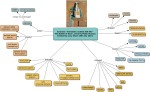
A strengths, weaknesses, opportunities and threats (SWOT) analysis of my work to date:

  • Strengths
    • Research skills- can locate information from a variety of sources; verbal, aural, oral and text based
  • Weaknesses
    • The Internet- very distracting for subject specific research
  • Opportunities
    • Write up exhibition and gallery visits before the start of the next part of the course
  • Threats- time management; I must not get carried away by a specific artist/art movement. I must try to remain focussed on what the tasks are asking for.

It seems to me that I have clearly demonstrated that I can retrieve information from a wide-variety of sources such as; books, journals, exhibitions and the Internet. As well as through communication with other individuals, such as curators and gallery/ museum staff. I have thoroughly enjoyed my visits to the Watts Gallery and the Pallant House Gallery. These visits have helped me to contextualise my work and bring the subjects to life.

I have sourced a multitude of reading materials to improve my knowledge and understanding and to improve my reading and writing skills. I have utilised the internet also, but I try to limit my use to accredited sources only as otherwise it can be difficult to verify the source of the information.

It has been enormous fun tailoring my visits to places which will enhance my studies and this has allowed me the opportunity to delve into areas which really interest me. Following a visit to Pallant House Gallery during this part of the course I have developed some ideas for the Critical Review in Part Five.

I have tried to analyse many different works of art and to evaluate them effectively. But I feel sometimes that I write too much and there is a tendency to go off on a tangent. So now I try to stick to the main points of the exercise. This is an area that I continue to observe closely.

In my opinion I believe that I have shown evidence of analysis and reflection throughout this section of the course. There hasn’t been enough time to write up all of my visits to galleries and all of the books that I have read, but I have completed every single Research Point and Exercise as well as all of the assignment requirements.

I think I can communicate my ideas effectively through my blog via the combination of imagery and text. If I need to show evidence of communication through spoken form then I can use Skype/ Google Hangouts in a discussion with my tutor.

In future I think there are opportunities to develop my critical thinking skills in relation to the history of art. Time management remains an issue but only because I have had much-needed breaks during this section of the course. I am aware also that I need to continue to improve my referencing skills and citations as this is an area I struggle with as I source information from a multitude of sources. During this part I have used information boards and leaflets and sometimes these aren’t properly accredited/ referenced. Where this is the case I have instead stated the corporate author rather than an individual.

I would like to have had more time in relation to the writing up of my visits to galleries and museums. I will try to do this at the start of the next part of the course as this has been highly beneficial and has provided the inspiration for future areas of interest.

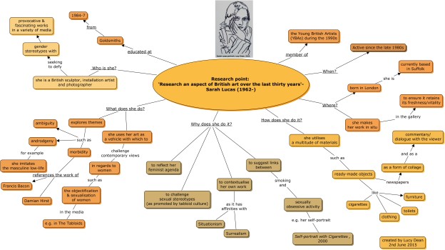
I will continue to read monographs and essays about specific artists. The artists that I have most enjoyed learning about in this section were: Eva Hesse and Sarah Lucas. Both had very interesting stories to tell and their work was suitably impressive.

I have also enjoyed reading about the work of Portuguese artist Paula Rego as I love her etchings and paintings. Another artist whose life and work has inspired me is Frida Kahlo; a deeply fascinating individual due to her Mexican heritage. I will explore ways in which to include both their works in the next section of the course.

Assignment 3 – A copy or analysis

For this assignment I could choose to either make a copy of a painting or analyse a painting or sculpture.

I have made a copy of a seventeenth-century still life by Sebastien Stoskopff as it is a masterpiece of the Vanitas genre. Vanitas with a vase of theriac, is an exemplary example of this genre due to the choice of subject matter, the composition and the light set-up which results in dramatic cast and core shadows. The scene appears to be shrouded in mystery due to the sombre atmosphere and limited colour palette.  (Tate, n.d.)

I decided to create my own version of this still life as I wanted to try to emulate the strong light and dark tonal values whilst also attempting to draught the objects in as convincing a manner as possible.

The experience was particularly challenging as I usually paint/draw from life. I prefer not to work from reproductions as it is considered bad practice. It is also incredibly difficult to gauge the accuracy of the light levels, the environment and the local colours. Also, photographs flatten the picture planes which can perplex artists whose aim is to attempt to accurately render the proportions. As an artist, my intention is also to carefully observe and segregate the picture planes to generate a sense of perspective. The alternate impressions of recession and projection are very important otherwise a painting/drawing looks flat, dull, lifeless and utterly unconvincing.

My first attempt using acrylic paint on oil painting paper was unsuccessful and deeply unsatisfactory. As you can see from the photograph, I used a grey wash to neutralise the white of the paper before painting. Once this first preparatory layer had dried I applied a light brown outline. These initial lines were pivotal as I soon discovered that I had made some fundamental errors in relation to the proportions and gesture of the skull. I am not used to using acrylic paint and I was not pleased with the results of the colour mixing. The values I had created appeared to be too close to one another and as a result my skull was not particularly three-dimensional. Also, working on such a small scale (A4) did not lend itself to this technique.

I decided therefore to disregard using acrylic paint in favour of oil paint. I prefer to use oils as the drying time is much slower and as a result one has more time to work on a painting. I always feel rushed with acrylics and make mistakes as a direct result. Oil painting is an ideal medium for fine observation and thus was perfect for my next painting.

I decided for the final assignment piece to continue to use a neutral grey ground as a mid-tone. The grey ground was perfect to eradicate the glaring white of the canvas board and was the ideal choice for my first paint layer. I realise that Stoskopff would have used oil on a wooden panel as canvases were not widely adopted at this time and so the effects that I created would be quite different from his. My choice of materials for the second painting were therefore more appropriate as they were closer to what he would have used.

My intention was to produce an interpretation rather than a direct copy as various reproductions of this still life differ widely on the internet. For instance, the printed copy that I used as a reference included far more saturated colours than was evident on the computer screen. It also seemed to me that it would be unwise to faithfully copy his version given my choice of materials and the fact that I was working from a reproduction and not the real McCoy.

Due to the difficulties identified I selected a monochrome colour palette of Titanium White and Ivory Black oil paint as I sought to recreate the tonal values, gesture and proportions.

Over the course of the painting exercise it became clear that Stoskopff used a limited colour palette of lead white, cadmium yellow, yellow ochre, terra rosa, burnt umber, ivory black and some ultramarine or lapis blue. A limited colour palette is often used by art students to learn how to mix colour and value. The fact that Stoskopff used it so successfully is due to his ability to accurately render tone and form. All of the colours present in his painting can be blended using a limited colour palette and I believe that Stoskopff used this range of pigments to recreate the subtleties present in the original still life.

It seems to me that Stoskopff used a combination of cadmium yellow, yellow ochre and lead white to create the skull, the lemon juice and the box containing the sweetmeats. The light is cool; suggesting an overcast day; resulting in warm shadows. Some of the core and cast shadows carry subtle hints of burnt sienna which can be blended using terra rosa and yellow ochre. There are pale yellow notes present throughout to suggest reflected light. The table is comprised of a cool grey which contrasts with the intensity/saturation of the skull and the other objects.

Finally, in my version I did not include the comb and vanity set (situated to the right of the picture plane) as I wanted the skull to be the primary focus of this Vanitas still life- a true symbol of the transience of life  (Tate, n.d.).

Bibliography

David Koetser Gallery. (2011) Sebastien Stoskopff. [Online]. Available from: http://www.koetsergallery.com/Sebastien-Stoskopff-Strasbourg-1597-Idstein-1657-Vanitas-with-vase-theriac-DesktopDefault.aspx?tabid=6&tabindex=5&OBJECTID=458190  [Accessed 9 June 2015 and 12 July 2015]

Norton Simon Museum. (2015) Stoskopff, Sebastian. [Online]. Available from: http://www.nortonsimon.org/collections/browse_artist.php?name=Stoskopff%2C+Sebastian [Accessed 3rd July 2008]

Tate. (n.d.) Vanitas. [Online]. Available from: http://www.tate.org.uk/learn/online-resources/glossary/v/vanitas [Accessed 17th June,12th July 2015 & 27th September 2016]

Exercise: ‘Annotate a Cubist still life’

For this exercise I must annotate a Cubist still life painting or collage. The Cubist still life collage I have selected is entitled: The Bottle of Suze, 1912 by Pablo Picasso.

I have chosen this still life in particular due to its interesting fragmented composition and its importance in the history of Western culture.

In The Bottle of Suze the objects depicted are easily recognised as a bottle and a glass on a table. The genre of the still life is conventional but the representation of it is not. The various fragments of newspaper which form the background suggest that this is a cafe setting which would have been popular with Picasso and his associates. The day’s newspaper seems to be open and ready to be read alongside the bottle of the Suze aperitif.

The introduction of the newspaper is an interesting choice as it generates further interest and sets the scene. The articles describe a war in the Balkans (November 1912) and a peace demonstration in Paris. This provides some documentary evidence of the years leading up to the Great War.

In spite of all of this factual evidence the depiction of the scene is certainly not typical. There is very little definition between all of the different elements which results in an air of ambiguity. The table, glass and bottle appear to be viewed simultaneously in profile and from above. The background and foreground appear to be one and the same; while the predominantly geometric composition appears patchy and cobbled together.

I think there is some variety in the work and the teal sphere is essential in the overall scheme. The sphere elevates the composition and helps to describe the narrative. The collage has a rhythm which is due to the strong verticals and horizontals which bisect the picture plane.

The jagged black shapes dominate as they contrast dramatically with the rest of the image and draw the eyes around the page. I think the charcoal details are successful and pull the image together marginally, but the overall scheme is too dark and too brown. As a result the mood seems rather subdued.

Technically the image is not challenging or well composed but I admire Picasso’s desire for change and his courageousness in attempting to challenge the elite.

I think the collage is not harmonious and unified as too many elements seem disparate. The proportions are deliberately strange as Picasso has subverted them. I think he was trying to challenge conventional ideas about the still life and interpret it in a different way.

The work itself is visually interesting but is not my cup of tea. The elements are fine but the image is not very well devised/resolved. The work does not feed my imagination and leaves me a bit cold. I prefer Picasso’s Cubist sculptures and ceramics as they are fully fledged standalone pieces.

As with many of Braque and Picasso’s papier collés or paper collages a sense of status was attributed to them later by their dealer Kahnweiler. These works are considered as important as their oil paintings due to their material nature and the composition. Their very status as Cubist works means that they are important to the history of art.

Bibliography

Green, C. (1994) Alienation and Innovation 1900-1918. In: Hooker, D. (ed.) History of Western Art From Ancient Greece to the Present Day. London, Pipit Press, pp. 366-374.

Research point: ‘Pop art’

For this task I must look at some Pop art images and make notes in my learning log regarding the artist’s choice of subject. If possible, I also need to find out what the artist had to say about their choice.

I must also identify whether the image qualifies as a still life. If not, then why not? What if any are the criteria for still life?

In Campbell’s Soup Cans (Chicken with Rice, Bean with Bacon), Andy Warhol trivialises the everyday object of the soup can and transforms it into art. During the 1960s Warhol transformed mass-produced objects and information from the mass media into art. His aim was to make art itself trivial and commonplace. He sought to break down the barriers between elitist so called “high art” (Osterwold, 1999) and the average person. He presented his art as a commonplace, ready-made item and transferred it to the gallery environment; thus making it socially acceptable to the viewer. The aim of the Pop art style was to depersonalise mass media aspects of pop and to instead present it in terms of a subjective image.

The pop artists re-produced and reinterpreted imagery which anybody on the street would recognise and could relate to; for instance comics, advertisements, picnic tables, menswear, coke bottles, light switches etc.

It seems to me that Warhol’s choice of subject matter could be considered a still life as it is a representation of an inanimate object removed from its original context. It has a modern feel due to the choice of media but it nonetheless embodies the typical characteristics of a still life of a man-made item.

 Bibliography

Osterwold, T. (1999) Pop Art. Koln, Taschen. 

Exercise: ‘Annotate a still life painting by Cézanne or Van Gogh’

For this exercise I must annotate a still life painting by Cézanne or van Gogh and answer the following questions: how does this annotation differ from the earlier annotation of a seventeenth- or eighteenth-century still life painting? Which did I find easier and why?

In Blossoming Almond Branch in a Glass, van Gogh explores his interpretation of the Japanese print via the flattened planes of pure pigments, the simplistic manner of representation and the use of hard outlines.

This is an important work by van Gogh as it is in homage to works by Japanese masters such as Utagawa Hiroshige. The almond blossom is a direct reference to the cherry blossom which is a national symbol of Japanese culture; hence it is a very popular subject in Japanese prints. The cherry blossom is much-revered in Japanese society as it represents the brevity of human existence and life itself. These exquisite plants are much-treasured due to their inherent beauty and brief life-span.

This annotation differs from the earlier annotation of a seventeenth-century still life due to the nature of the painting and the thoughts which inspired it. In the earlier centuries the emphasis was on the acquisition of various skills such as proportion, gesture, value/tone, colour and paint handling. This was due to the academic tradition which was prevalent in European schools of art at this time.

However, from the nineteenth-century onwards artists decided to discard the rule book in favour of absorbing other influences such as photography and Japanese culture. This led to a series of art movements and an eventual move towards modern art.

I personally found the previous exercise considerably easier and more interesting as I have trained in an atelier which teaches the old masters techniques. I prefer traditional art, as I think it is extremely useful (as an art student) to learn the academic tradition as it provides the foundation for all manner of creations.

Also, during the seventeenth- and eighteenth-centuries artists were considered artisans, due to their knowledge and experience and as a result it elevated their craft. Young, aspiring individuals became apprentices to older and more experienced artists in order to learn the techniques and the trade. The nineteenth-century initiated the demise of a centuries old tradition which effectively ensured that the European art schools gradually lost the skills which formerly had been passed down from generation to generation since before the Renaissance.

It seems to me that there is plenty to learn from the still life genre, depending on one’s level of interest. As an art student however I prefer to adopt a wider and more encompassing view as I believe that a great deal can be learnt from all of the various movements and periods.

In my opinion Blossoming Almond Branch in a Glass is a beautiful painting, but it does not inspire me as much as other works by Van Gogh due to the colour palette and manner of depiction. I learnt a great deal more from Sebastien Stoskopff’s still lifes which incorporated fascinating themes such as the Vanitas and the Memento mori. This particular still life of Van Gogh’s simply does not compare.

Bibliography

Honour, H. & Fleming, J. (2009) Impressionism to Post-Impressionism. In: Archer, M. (ed.) A World History of Art (revised 7th edition). London: Laurence King. pp. 712- 715.

Ikon gallery (2007) Utagawa Hiroshige. Birmingham, Ikon gallery.

TheHuffingtonPost.com, Inc. (2015) The Significance of the Cherry Blossom: From Beloved Tree to Cultural Icon. [Online]. Available from:  http://www.huffingtonpost.com/homaro-cantu/the-significance-of-the-c_1_b_3832895.html [Accessed 16th July 2015]

Walther, I. & Metzger, R. (1993) Vincent Van Gogh The Complete Paintings. Koln, Benedikt Taschen.

Research point: ‘Van Gogh’s letters’

For this task I must research and review some excerpts from Van Gogh’s letters. I will also answer the following question: how do Van Gogh’s words contribute to or complement my viewing of his sketches and paintings?

Van Gogh’s words contribute to our understanding of his art as they describe the multitude of influences and interests that shaped his work over the course of his life.

The letters provide an essential insight into the inner workings of his mind and the connections between his family and friends. Prior to reading his letters I hadn’t realised how much lively and effusive discourse had passed between him and his extended acquaintance. He was a very articulate artist devoted to his passions for painting, drawing, languages (he spoke French, Dutch and English fluently) and literature.

He was influenced at the start of his career by his firmly religious upbringing and his work as a lay preacher in Holland. One of his masterpieces from this period, The Potato Eaters; describes the harsh realities and hand-to-mouth existence of the peasants who worked the land. The Potato Eaters is an exceptional work which is both sensitive and thoughtfully composed. Van Gogh portrays the peasants in a sympathetic manner at the dinner table feasting on the day’s harvest. It is a dark and brooding portrait; produced prior to his migration to France so it is entirely different in tone and style from his later pieces.

In a letter to his brother Theo dated Thursday 9 April 1885; on the subject of The Potato Eaters Vincent acknowledges the challenges involved in painting from life:

“See, this is what the composition has now become. I’ve painted it on a fairly large canvas, and as the sketch is now, I believe there’s life in it. But I know for certain that C.M., for instance, would speak of — badly drawn &c [sic]. Do you know what can definitely be said to counter that? That the beautiful effects of the light in nature require one to work very fast.” (Van Gogh Museum, 2009).

“Now I know very well that the great masters were able both to finish and to maintain the vitality, particularly in the period of their mature experience. But that’s something I certainly won’t be able to do like that for the time being. At the point where I now am, though, I see a chance of giving a felt impression of what I see. Not always literally exactly — rather never exactly — for one sees nature through one’s own temperament.” (Van Gogh Museum, 2009).

In his letter Vincent recognises that the painted sketch (or prepatory study of The Potato Eaters) includes a number of errors but he also acknowledges the importance as an artist to not merely copy what is in front of one’s self. He clearly shares the view with other artists that the overall experience of working from life is essential and that it is primordial to make mistakes in order to learn. It seems to me that Van Gogh demonstrates his resilience and the belief that he will improve with practise as his predecessors did. Van Gogh later proved that he could overcome these difficulties via continual practice and constant observation. Furthermore, I believe his early training and experiences as a priest helped to instil a disciplined and devout approach to the making of his myriad sketches, etchings and paintings.

His letters are the key to understanding his principal aims and objectives and add an additional layer of humanity to his oeuvre. I always believed that Van Gogh was misunderstood and his work underappreciated and I now know that to be the case. His letters are beautifully written and as an artist I can appreciate the anxiety of trying to create works which satisfy one’s own desires but also meet the needs of the buying public. The business of buying and selling art is very challenging as one must convince another of the inherent value in a piece of art. However, all too often people only consider price over quality. I can well imagine how frustrating and difficult it must have been for Van Gogh particularly as he mostly worked in isolation. I can also appreciate that the affectionate and supportive relationship he shared with Theo, was not only a financial necessity, but also a lifeline.

Bibliography

Van Gogh Museum. (2009) To Theo van Gogh. Nuenen, on or about Saturday, 4 April 1885. [Online]. Available from:  http://vangoghletters.org/vg/letters/let489/letter.html [Accessed 14th & 16th July 2015]

Van Gogh Museum. (2009) To Theo van Gogh. Nuenen, Thursday, 9 April 1885. [Online]. Available from: http://vangoghletters.org/vg/letters/let492/letter.html [Accessed 14th & 16th July 2015]

Van Gogh Museum. (2009) To Willemien van Gogh. Paris, late October 1887. [Online]. Available from:  http://vangoghletters.org/vg/letters/let574/letter.html [Accessed 14th & 16th July 2015]

Van Gogh Museum. (2009) To Theo van Gogh. Arles, Thursday, 5 July 1888. [Online]. Available from:  http://vangoghletters.org/vg/letters/let636/letter.html [Accessed 14th & 16th July 2015]

Van Gogh Museum. (2009) To Theo van Gogh. Paris, between about Sunday, 17 and Tuesday, 19 July 1888. [Online]. Available from: http://vangoghletters.org/vg/letters/let571/letter.html  [Accessed 14th & 16th July 2015]

Vincent van Gogh: A New Way of Seeing. Dir. Phil Grabsky. Perf, Jamie de Courcey. Exhibition on Screen, 2015. Film.

Exercise: ‘Annotate and analyse a still life image’

For this task I must annotate either a seventeenth- or eighteenth-century still life image.

I have decided to analyse the Still Life with Empty Glasses, c.1640, by the German artist Sebastien Stoskopff as it is a tour-de-force of illusionism and artistic skill.

In the first part of the exercise I have produced two spider diagrams which describe the main elements of the painting and their relationship to one another:

This still life is essentially an exercise in demonstrating the artist’s supreme skill with regards to rendering a multitude of translucent, transparent and lustrous surfaces which catch the eye and appeal to the senses. It is a lavish display of wealth and achievement; which is enhanced by the artist’s signature of dulling the background in order to enhance the subject matter and bring it to life.

The assortment of objects is of interest as some of the props possess symbolic meanings. For example, the shards of delicate glass in the foreground (remnants of a beautiful broken wine glass); refer to the fragility and brevity of human existence. They also serve to remind the viewer that all is not perfect in life. Whilst the overturned pitcher of wine implies that the sweetness of life can be easily unbalanced. Similarly, the discarded wine glass to its right suggests the fleeting pleasures of life.

The precariously situated wooden utensil in the foreground draws the viewer’s eyes and creates subtle angles which mirror those of the other implements. Props such as these also serve to generate a sense of recession and projection- a useful tool for any artist when trying to convey perspective.

In my opinion the composition is harmonious and is unified by the combination of effulgent utensils which catch the light as it cascades in via the window. The objects have been arranged in a particularly delightful manner which allows the viewer’s eyes to drift over the composition in a ‘w’ formation from top to bottom, left to right.

The proportions are accurate and convincing; nothing seems out of place or sync. There is plenty of variety in this painting due to the choice of glassware and receptacles which complement one another beautifully and add to the overall narrative. The narrative is curious as the impression is that this is a domestic environment; and yet the objects are expensive and well beyond what the average person would have been able to afford. Therefore I believe that the home and the utensils belong to a wealthy merchant.

I believe there is rhythm and movement in the image as one’s eyes absorb the level of detail and navigate the picture plane.

This still life is a veritable feast for the eyes as it includes a fascinating array of household paraphernalia arranged within a dynamic composition. A similar work by Stoskopff is Vanitas with a vase of theriac, but as an earlier work it lacks the refinement of Still life with Empty Glasses. 

In my opinion the artist has used a limited colour palette of lead white, cadmium yellow, yellow ochre, burnt sienna/terra rosa, burnt umber, ultramarine blue and ivory black oil paint. The use of these pigments is particularly successful due to their richness which augments the lavishness of the assemblage.

I find the work hugely appealing as I adore the variety of textures and surfaces and the assortment of objects which make a pleasing composition. The draughtsmanship is excellent and the attention to detail is staggering. My favourite details are the reflections of the window in the glass goblet and the highlights on the wine glasses. This work feeds my imagination as it provides me with the inspiration for my own still life compositions. I have no doubt that Stoskopff was a very accomplished artist as I know from experience how difficult it is to draught transparent and translucent surfaces. It takes years to master the techniques and supreme confidence when working with colour and value.

It seems to me that Still Life with Empty Glasses is a coup de maître and something to be admired for many years to come.

Bibliography

David Koetser Gallery. (2011) Sebastien Stoskopff. [Online]. Available from: http://www.koetsergallery.com/Sebastien-Stoskopff-Strasbourg-1597-Idstein-1657-Vanitas-with-vase-theriac-DesktopDefault.aspx?tabid=6&tabindex=5&OBJECTID=458190  [Accessed 9 June 2015 and 12 July 2015]

Norton Simon Museum. (2015) Stoskopff, Sebastian. [Online]. Available from: http://www.nortonsimon.org/collections/browse_artist.php?name=Stoskopff%2C+Sebastian [Accessed 3rd July 2008]

Tate. (n.d.) Memento mori. [Online]. Available from:

http://www.tate.org.uk/learn/online-resources/glossary/m/memento-mori [Accessed 17th June and 12th July 2015]

Tate. (n.d.) Picasso: Peace and Freedom: Room 2: Still Lifes. [Online]. Available from:

http://www.tate.org.uk/whats-on/tate-liverpool/exhibition/picasso-peace-and-freedom/picasso-peace-and-freedom-explore-1 [Accessed 17th June and 12th July 2015]

Tate. (n.d.) Still life. [Online]. Available from:

http://www.tate.org.uk/learn/online-resources/glossary/s/still-life [Accessed 17th June and 12th July 2015]

Tate. (n.d.) Vanitas. [Online]. Available from:

http://www.tate.org.uk/learn/online-resources/glossary/v/vanitas [Accessed 17th June and 12th July 2015]

Research point: ‘The Iconography of still life paintings’

For this task I have to research the iconographical significance of some of the objects commonly depicted in still life paintings.

In the religious age of Seventeenth-century Holland Vanitas and Memento mori paintings were hugely popular and much-coveted items due to the common belief that the present life was simply a preparation for the afterlife. The principal idea was that if you performed good deeds in this life then you were rewarded with a safe passage into the next one.

Ordinary folk collected works of this nature as a reminder of the importance of piety and generosity towards others. It was considered greedy to covet earthly goods and to indulge in vices, as this would lead to eventual dissipation. This was a deeply spiritual and pious period of Western culture.

Bibliography

David Koetser Gallery. (2011) Sebastien Stoskopff. [Online]. Available from: http://www.koetsergallery.com/Sebastien-Stoskopff-Strasbourg-1597-Idstein-1657-Vanitas-with-vase-theriac-DesktopDefault.aspx?tabid=6&tabindex=5&OBJECTID=458190  [Accessed 9th June 2015 and 12th July 2015]

Tate. (n.d.) Memento mori. [Online]. Available from:

http://www.tate.org.uk/learn/online-resources/glossary/m/memento-mori  [Accessed 17th June and 12th July 2015]

Tate. (n.d.) Picasso: Peace and Freedom: Room 2: Still Lifes. [Online]. Available from:

http://www.tate.org.uk/whats-on/tate-liverpool/exhibition/picasso-peace-and-freedom/picasso-peace-and-freedom-explore-1  [Accessed 17th June and 12th July 2015]

Tate. (n.d.) Still life. [Online]. Available from:

http://www.tate.org.uk/learn/online-resources/glossary/s/still-life  [Accessed 17th June and 12th July 2015]

Tate. (n.d.) Vanitas. [Online]. Available from:

http://www.tate.org.uk/learn/online-resources/glossary/v/vanitas  [Accessed 17th June and 12th July 2015]

Exercise: ‘a symbol for the present’

For this task I have to select a symbol for this year. My focus could be local, national or international. I also have to consider who I will ask to execute the work.

I have selected the artist Lucy Burley to create a series of large-scale ceramic vessels inspired by the heritage of my home town, Farnborough (Hampshire). The reason for my choice is obvious as Farnborough was once the centre of a thriving pottery industry from the mid-15th century until the early 20th century.

My choice might surprise some people as Farnborough has become synonymous with aviation since Samuel Franklin Cody launched his first manned flight in Farnborough in 1908. However I decided on reflection that there were plenty of ‘symbols’ devoted to aviation in Farnborough already and so my intention was instead to raise awareness of the local pottery industry. The only allusion to the former industry was the Potter’s Arms pub in Cove, Farnborough which has since closed.

Farnborough was once a hub for the creation of ceramics of a utilitarian nature which once constructed were bisque fired, glazed, fired once more and then sent to London to be sold at market. Most of the Borderware that remains is now housed in the Museum of London. It can be characterised by the natural-coloured earthenware glazes and the distinctive forms (such as the goblets and skillets).

Lucy I feel is perfect for this hypothetical commission as I know from personal experience that she can work with the community to produce a work(s) of art which best represent all of our interests and needs. She has also created her own Borderware inspired vessels which were exhibited at the Aldershot Military museum in 2013.

Bibliography

London Mudlarker. (2013) Surrey and Hampshire Borderware. [Online]. Available from: https://www.pinterest.com/JuliaNlondon/surrey-hampshire-border-ware/  [Accessed 4th June 2015]

London Mudlarker. (2013) Surrey and Hampshire Borderware. [Online]. Available from: https://www.pinterest.com/pin/430797520575531137/ [Accessed 4th June 2015]

Lucy Burley. (n.d.) Lucy Burley Ceramics. [Online]. Available from: http://www.lucyburley.co.uk/  [Accessed 4th June 2015]

Museum of London. (n.d.) Surrey/Hampshire border ware. [Online]. Available from: http://archive.museumoflondon.org.uk/ceramics/pages/subcategory.asp?subcat_id=706&subcat_name=Surrey%2FHampshire+border+ware   [Accessed 4th June 2015]

Pearce, J. (n.d.) Evidence for the Early 16th-century Surrey-Hampshire Border Ware Industry from the City of London. [Online]. Available from: http://www.medievalpottery.org.uk/mc21.htm#srt3 [Accessed 4th June 2015]

Rushmoor Borough Council. (n.d.) Farnborough civic quarter development proposals. [Online]. Available from:  http://www.rushmoor.gov.uk/article/8267/Farnborough-civic-quarter-development-proposals  [Accessed 4th June 2015]

Research point: ‘research an aspect of British art over the last thirty years’

For this task I have to research an aspect of British art over the last thirty years. The brief is quite broad so I have elected to find out more about the work of Sarah Lucas; one of the YBAs (Young, British, Artists).

Sarah Lucas rose to prominence during the 1990s with controversial and provocative works such as Bitch, Nice Tits, Bunny Gets Snookered, and I might be shy but I’m still a pig. Examples such as these typify her resolution to challenge gender stereotypes, tabloid culture, male gratification and the objectification of women in Western society.

Due to the abundance of literature concerning the artist and her work I have limited myself to focusing solely on the sculpture Pauline Bunny which is part of the installation Bunny Gets Snookered as it exemplifies her overall approach. The analysis for this piece is in the form of two spider diagrams; the first describes the artist and the ideas which are crucial to understanding her oeuvre and the second examines the piece Pauline Bunny in more detail.

In my opinion Pauline Bunny is a particularly interesting sculpture as it forms part of the larger installation Bunny Gets Snookered. Pauline Bunny is significant for a number of reasons; not least because of the recognition of its importance within the overall scheme. Attributing a name to the mannequin effectively elevates the piece from the other so-called ‘bunnies’ who remain anonymous and characterless (Manchester, 2000-2002). Also the name Pauline is a direct reference to the real-life Pauline Daley; an assistant of Sadie Coles, Lucas’s art dealer.

Pauline is the skinniest of all of Lucas’s bunnies which reflects current body ideals and attitudes. She embodies contemporary notions of skinniness which people typically associate with success. She is at once seductive (due to the presence of black stockings), important (in reference to her title) and enjoys elevated status as leader of the pack. The black stockings further emphasise the impression of attractiveness, sensuality and submission. In contrast to this her posture is both confident and submissive. The effect could not be more striking.

It is also interesting to note that Lucas refers to the other sculptures as ‘bunnies’ (Manchester, 2000-2002), which might be interpreted as a playful nod to Hugh Hefner’s playboy bunnies- which for some people are problematic. Does he diminish women by forcing them to wear ‘bunny’ costumes or is it a celebration of their inherent desirability? Pauline Bunny by comparison seems to subvert the idea of the desirability of a so-called bunny; as it possesses sagging forms and a passive demeanour; which provide a comic interpretation of feminine compliance and male gratification.

In conclusion I think Pauline Bunny is a deeply fascinating piece due to its ambiguity and the implications of objectification and violation. The manner of representation is particularly interesting as the figure is essentially headless which implies that the sculpture is empty-headed. The posture of the mannequin is illuminating as splayed legs are considered to represent power in the male domain but in the female arena they represent promiscuity. It seems to me that Pauline Bunny is a powerful work which comments on the ridiculousness of the process of objectification. This is undoubtedly a thought-provoking piece which creates a dialogue with the viewer, by offering more questions than it answers. Lucas is clearly very adept at leaving the spectator wanting more and ensuring that they return to her works time and again.

Bibliography

Cooper, J. (n.d.) Growing Up The Young British Artists at 50. Munich, Prestel.

Manchester, E (2000-2002) Pauline Bunny. [Online]. Available from: http://www.tate.org.uk/art/artworks/lucas-pauline-bunny-t07437/text-summary  [Accessed 2nd- 4th June 2015]

Museum Boijmans Van Beuningen. (n.d.) Sarah Lucas. [Online]. Available from: http://collectie2008.boijmans.nl/en/work/BEK%201678%20a-g%20(MK)   [Accessed 2nd- 4th June 2015]

Oxford University Press. (2007-2015) Lucas, Sarah. [Online]. Available from: http://www.oxfordartonline.com/subscriber/article/grove/art/T096887?q=sarah+lucas&search=quick&pos=1&_start=1#firsthit   [Accessed 2nd- 4th June 2015]

Searle, A. (2013) Sarah Lucas at the Whitechapel: more than the sum of her parts. [Online]. Available from:  http://www.theguardian.com/artanddesign/2013/sep/30/sarah-lucas-whitechapel-gallery  [Accessed 2nd- 4th June 2015]

Sooke, A. (2013) Sarah Lucas: funny, compelling, rude and really, really good. [Online]. Available from:  http://www.telegraph.co.uk/culture/art/art-reviews/10350461/Sarah-Lucas-funny-compelling-rude-and-really-really-good.html  [Accessed 2nd- 4th June 2015]

Stonard, J-P (2000) Sarah Lucas. [Online]. Available from: http://www.tate.org.uk/art/artists/sarah-lucas-2643  [Accessed 2nd- 4th June 2015]